Clever Monkey versus the Accelerationists (2)

Part Two: (Nick) Land, Capital and Labor (Theory)
Clever Monkey’s argument against the accelerationists seems to rest on a precise formulaic incantation repeated over and over: the only accelerationism possible is Nick Land’s accelerationism. Thus accelerationism itself is merely a virulent subform of neoliberalist ideology that advocates commodification of all human relations. Which is to say all talk of accelerationism must lead us to embrace anarcho-capitalism, the Thought of Murray Rothbard, and the good folks at the Mises Institute.
Clever Monkey versus the Accelerationists (1)
Part One: The Grammar of Left Fascism
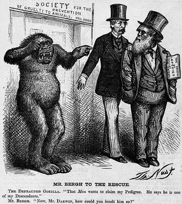
Twice in the past couple of weeks I Have been accused of being infected with an ideology known as accelerationism. To be honest, I had no idea what accelerationism was and never heard of it until the accusation was made. Nevertheless, I do accept the argument that ignorance of an ideology is no proof of innocence — at least insofar as people will make the accusation based on their criteria, not mine.
It turns out accelerationism is the idea that capitalist development can be sped up and the entire epoch brought to a close more rapidly than it would otherwise by pursuing measures designed to the end. Intrigued by this idea, I spent a few days trying to understand the concept, poring over the criticisms of those who oppose it, and thinking about the relation of this ideology to anything remotely suggested by labor theory.
What follows is my first take on the notion of accelerationism through the argument of one of its fiercest critics, Benjamin Noys, an editor at the venal academic paywall, Historical Materialism.
Keynesian Checkers versus Monetarist Three Dimensional Chess

You can almost smell the frustration pouring off Paul Krugman these days, as he once again proclaims the latest in a series of victories of Keynesian economic theory over its monetarists opponents.
Says Krugman:
“Sorry, guys, but as a practical matter the Fed – while it should be doing more – can’t make up for contractionary fiscal policy in the face of a depressed economy.”
Krugman’s argument, which is a continuation and expansion on a more extensive argument by Mike Konczal can be simplified: Keynesian policies are better at generating an overworked working class than monetarist policies.
Reinhart-Rogoff and Austerity: The math is not the problem

After reading and commenting on David Graeber’s post at the Guardian, I feel it necessary to comment more broadly on the problem the euro-zone faces in the crisis, as well as the problem posed by the austerity regime being pursued by the member nation of the European Union. My point is to show that the errors of the bourgeois economists Reinhart and Rogoff are not, as is commonly believed, a simple math or spreadsheet error. Behind these errors is concealed the fact that the euro-zone itself is founded on a fundamental structural flaw resulting from the monetarist economic theory on which it is constructed. This flaw was nothing more than an attempt to obstruct the working class majorities of the member nations from democratic control over their economies — a flaw that is now haunting the euro-zone and will likely cause its collapse.
A Few Words on David Graeber’s Guardian Article

David Graeber’s article in the Guardian, There’s no need for all this economic sadomasochism, is very disturbing because in it he adopts the argument of the MMT fascists. I want to state this clearly, although I am generally supportive of his activist work with Occupy, I think he is way off on this idea.
First he starts out by making the patently absurd argument that the euro-crisis is about morality, not profit:
“After all, as I and many others have long argued, austerity was never really an economic policy: ultimately, it was always about morality. We are talking about a politics of crime and punishment, sin and atonement.”
This, he knows, is not an accurate portrayal of austerity, but simply one that dovetails with his notions on debt in general. The aim of austerity has no more to do with morality than a tax on cigarettes has to do with discouraging smoking. The aim, in both cases, is to maximize fascist state control of economic life and maximization of profit through this control.
He then accuses Dutch and German voters of “fiscal sadism” because they don’t want their wages to bail out the holders of fascist state debts in Greece and Spain. What sort of nonsense is this? They should simply lie down and allow the banks to rummage in their wallets? The resistance to bailing out the Greece fascist state has less to do with “fiscal sadism” than a desire not to bail out German banks. I think, it is important we do not lump German voters in with German banksters in this crisis. While it is true, “Politicians locate economic theories that provide flashy equations to justify the politics”, this has nothing at all to do with the resistance of overwhelmingly working class voters to having their pocket picked by these politicians.
This conflation is bad enough, but then Graeber goes in to embrace the theoretical arguments of the fascistic Modern Money Theory (MMT) school. MMT is a ‘theory’ on the workings of so-called modern money, i.e., fascist state issued valueless counterfeit currency that began in use following the Great Depression. This counterfeited currency is employed by the state to manage economic activity within capitalist economies. It is the instrument by which the fascist state functions as national capitalist managing the national capital as direct exploiter of labor. It is impossible to employ this ‘theory’ in the interests of the vast majority of the society, who are being directly exploited by the state through the use of this currency.
Moreover, if MMT is correct, the problem faced in the euro-crisis exactly opposite of what it appears: there is not too much state debt, but too little. In modern money theory without sufficient debt, the excess capital sloshing around the system has no place to be profitably invested. To find a place for this fictitious capital, MMT argues, the fascist state must create an ever increasing quantity of debt instruments.
Which is to say, for German mercantilist policies to produce ever increasing quantities of excess capital, Greece must, at the same time, issue ever increasing quantities of bonds to absorb the German surpluses. Side by side with the German workers compelled to work long hours to produce otherwise unsellable exports, we get Greece workers working long hours to pay otherwise unrepayable public debts.
What sort of bullshit is this to adopt into Graeber’s anti-statist message?
The MMT argument is not particularly disturbing in itself. It merely carries the bourgeois economist’s argument to its absurd limits. What is disturbing, however, is the idea this “theory” is gaining any traction among antistatists. It is a completely fascistic theory that deserves only to be opposed wherever it rears its head.
Anti-statists have their own solution: wipe out all debts without exception and reduce hours of labor for the mass of society.
Anti-statists should not be trying to figure out how the states of Europe can carry even bigger loads of debt. Fuck the banksters — they can all go to hell and take their fascist mini-states with them.
My May Day Post: How Kautsky and Lenin Fundamentally Revised Marx

Part One: “… the consciousness of the necessity of a fundamental revolution”
In the Communist Manifesto, Marx writes:
“Does it require deep intuition to comprehend that man’s ideas, views, and conception, in one word, man’s consciousness, changes with every change in the conditions of his material existence, in his social relations and in his social life?”
In this statement Marx is arguing changes in material existence and social relations must produce changes in consciousness.
Based on his argument, we can assume when, in the German Ideology, he and Engels wrote capitalism gives rise to,
“a class which forms the majority of all members of society, and from which emanates the consciousness of the necessity of a fundamental revolution, the communist consciousness”,
they were making the argument capitalism gives rise to changes in material existence, social relations and social life that produces a communist consciousness.
I ask this, because I certainly don’t want to be accused of “stringing quotes together”. I want to be sure these two concepts — one from the Communist Manifesto, the other From the German Ideology — actually are related. I want to be sure the two arguments form a discrete, coherent and continuous line of reasoning going through their life’s work. This is so when I ask dumb fucking vanguardist groupuscules (like, e.g., the SWP (UK)) why they exist, I am on solid ground. But. more important, I want to make sure I am on solid ground when I begin looking at the arguments of both Kautsky and Lenin on the issue of working class consciousness. I don’t want any silly mindless vanguardists to say I am taking Engels or Marx out of context when I rip Kautsky and Lenin new assholes.
Where the fuck is the ‘revolutionary subject’ in the European crisis? (2)

Why the working class is not effectively defending itself actually is not a question posed by this crisis. Rather the question is:
“So what else did you expect?”
No matter how the working classes of Europe responded to this crisis politically, they were already effectively rendered politically defenseless before the crisis by the very structure of the euro-zone, which stripped the fascist states of Europe of their monetary sovereignty. So even before this crisis erupted into the open, the member states with their overwhelming proletarian majorities were already effectively kneecapped and rendered toothless. The very structure of the EU was nothing more than an attempt to rob the working class of any means to defend itself in a crisis. With monetary policy centralized in the European Central Bank the member states must follow procyclical policies during economic downturns. Essentially, they have no choice but to reduce their expenditures when the euro-zone experiences a depression.
Where the fuck is the ‘revolutionary subject’ in the European crisis?

An interesting question from George Magnus of the banking giant UBS via Zero Hedge: “Why Are The European Streets Relatively Quiet?”
To understand the background of Magnus’s question we have to go to 2010. At that time, the economist Michael Pettis predicted Europe would have three years or or so to impose its “labor restructuring” before all hell broke loose and national politics descended into chaos:
“I don’t in any sense pretend to be an expert on the subject, but one of the things that surprises me is that as far as I know (perhaps because I am looking in the wrong places) and in spite of very clear historical precedent, very few analysts, even the greatest euro-skeptics, are wondering about the changes in electoral politics that are likely to take place in Europe over the next few years as a consequence of the euro adjustment. For example Wolfgang Munchau has an excellent article in the Financial Times in which he concludes, like I did in my post last week, that:
The eurozone is manoeuvring itself into a position where it confronts the choice between two alternatives considered “unimaginable”: fiscal union or break-up.
Obviously I think he is right, but I would add that the window for that choice is a small one. If Europe doesn’t move quickly, within two or three years it will probably be very difficult, if not impossible, to engineer fiscal union. By then domestic politics are likely to be too unstable for the European political elite simply to arrange union over the heads of the citizenry.”
But here we are five years after the outbreak of the global crisis and almost three years after Pettis wrote his words, yet still European working classes are offering only limited resistance — nowhere near the sort of political chaos the bourgeois apologist Pettis imagined.
Wage Labor, Capitalism and Communism

Okay, so this is not going to be the usual examination on the topic of wage labor, capitalism or communism. Sometimes when you run into a conceptual brick wall it helps to completely change perspectives. I am trying to find a new way to describe why and how capitalism itself anticipates communism without producing a predictable 20th century Marxism argument.
CAVEAT: Of course, this just might fall completely flat, but thems are the breaks. So you can be skeptical of the result, since I am just attempting a thought exercise.

Re: The People
When we first began this blog, we stated the following as our aim:
This is a blog dedicated to the critique of the most important category of democratic thought: The People.
Several years have passed since then. During that time we have grown, and our understanding of forces determining the abstraction know as The People has been clarified in our minds.
It is high time for this abstraction, The People, which has never for even one instant actually embodied real living people, to meets its demise along with the social forces to give it life. Mankind has passed the point where an abstraction can stand in place of the real living individuals it purports to represent.
Let’s have an end to it and all abstractions.
For those who are interested, the complete archive of this blog can be found here: https://t.co/cLB2BES0Ox
I will continue to post at The Real Movement